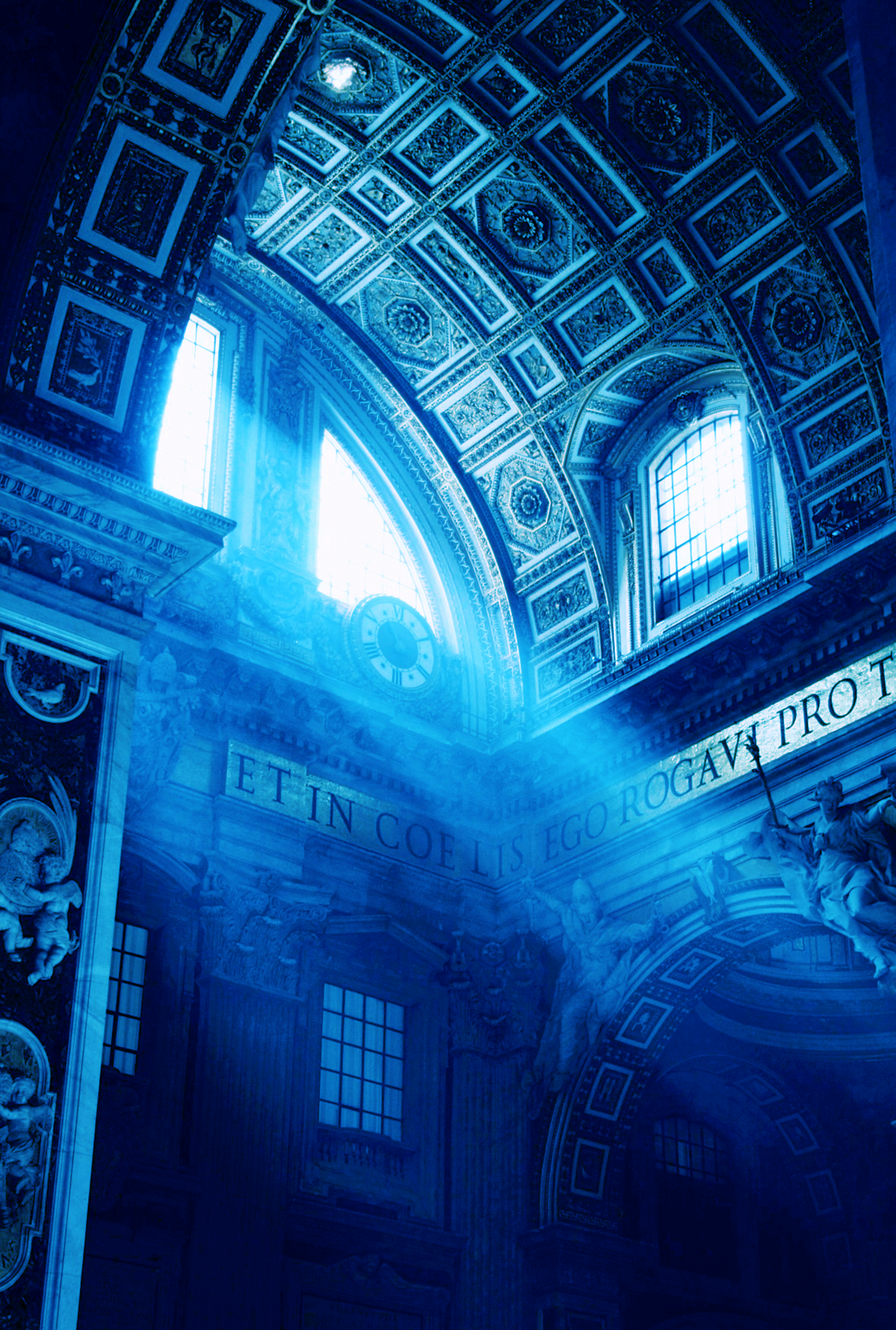
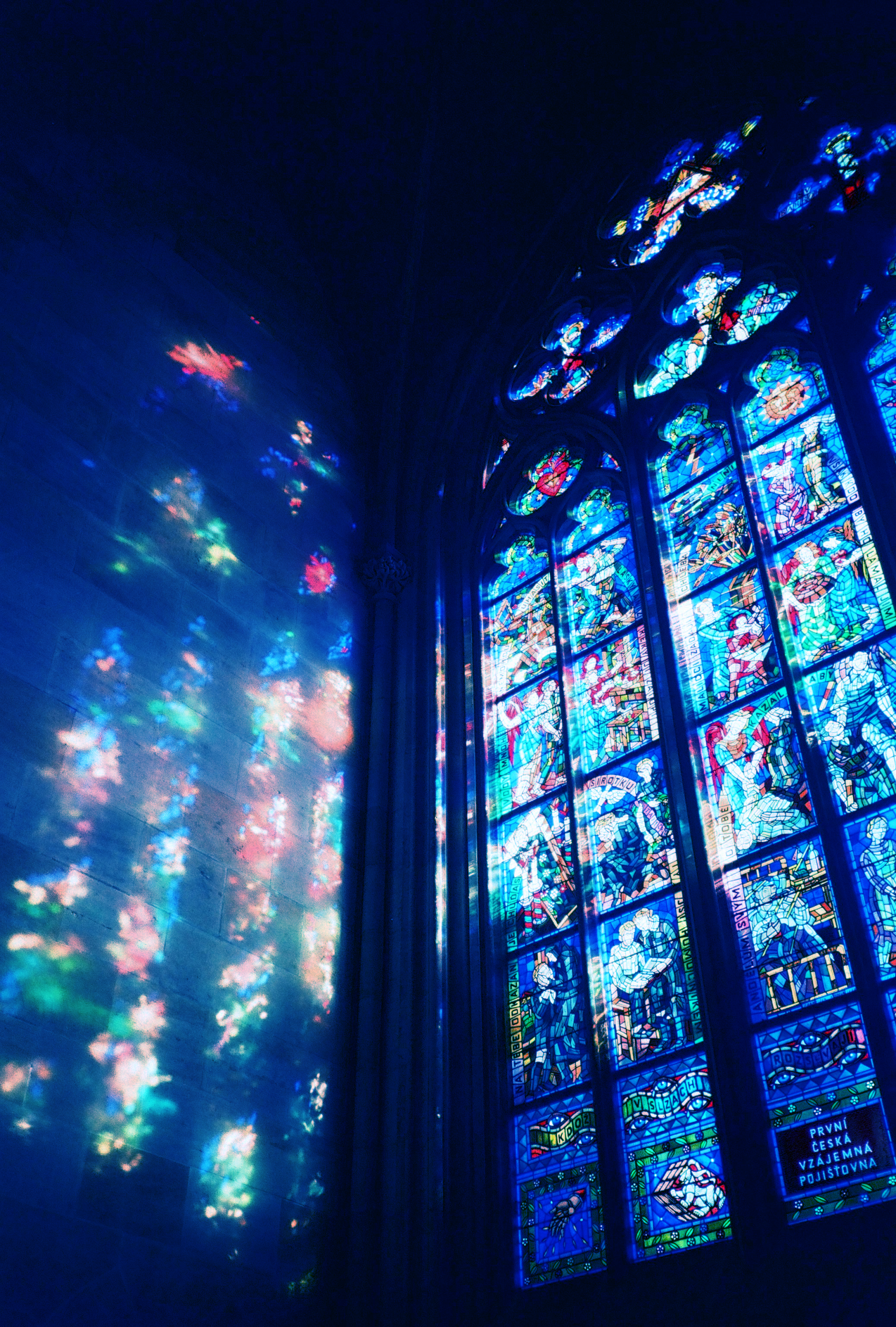
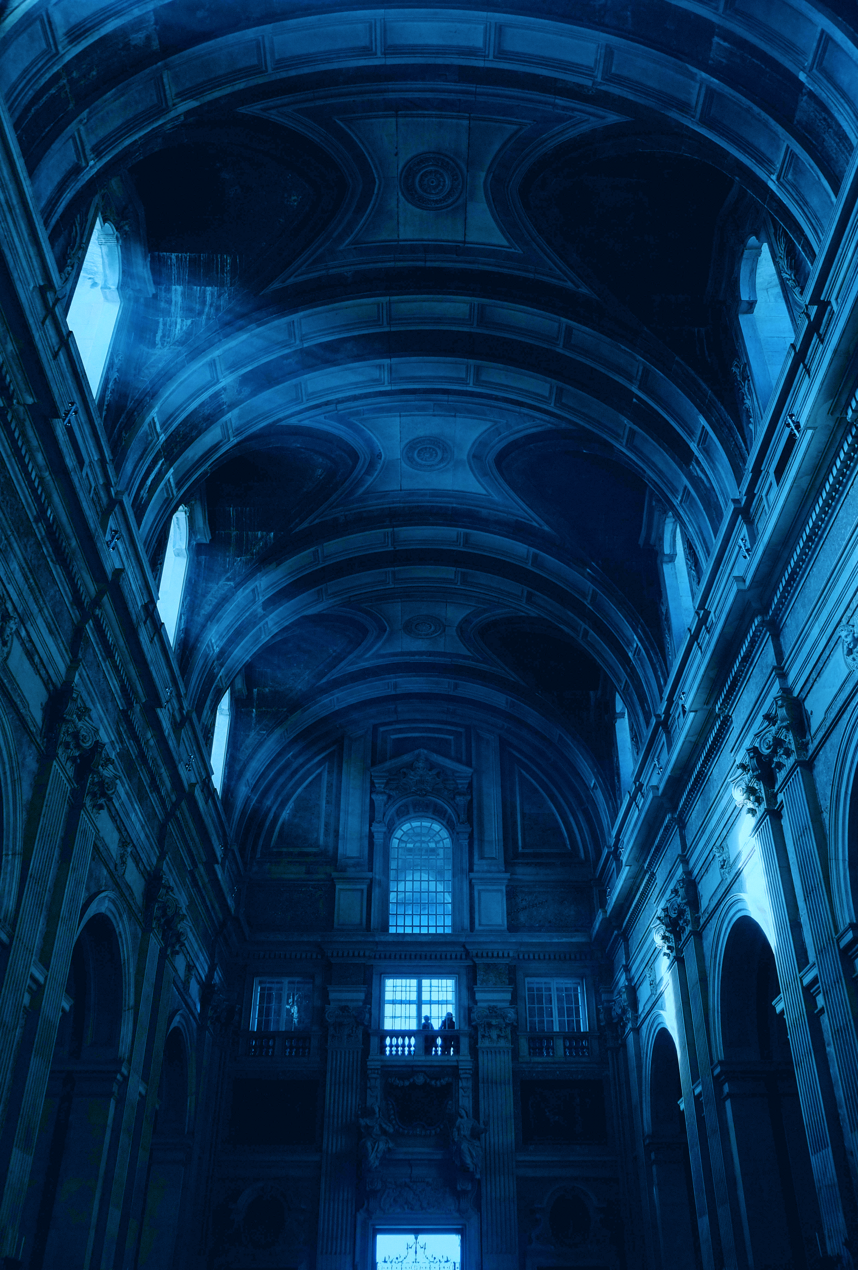
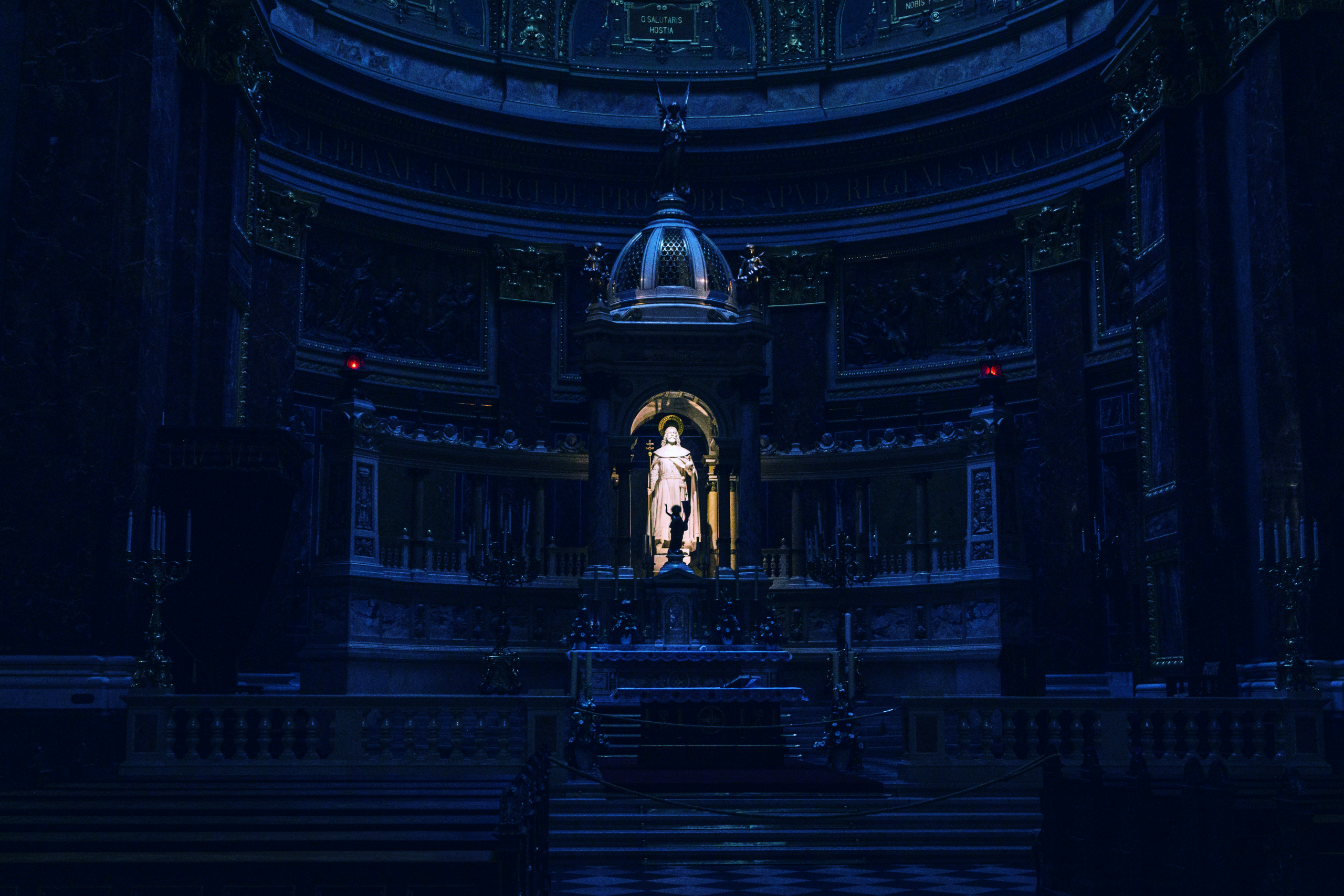
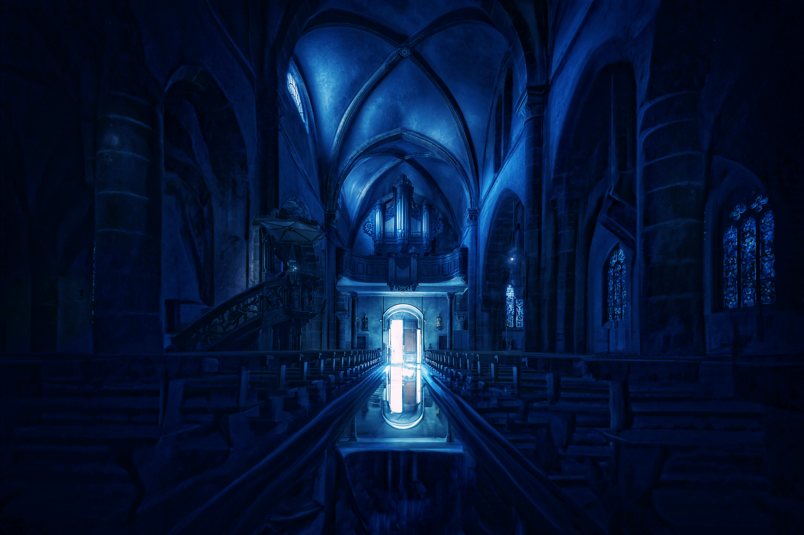
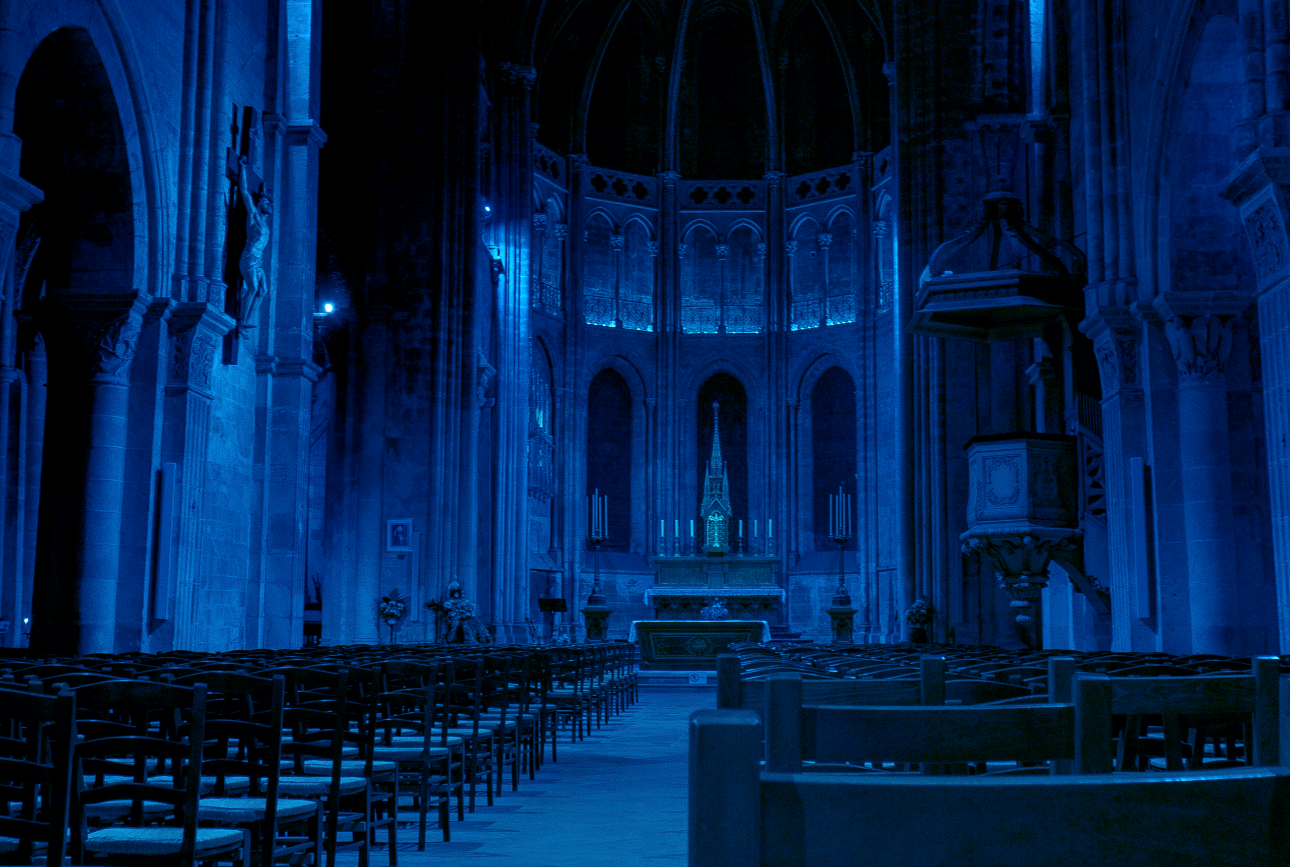
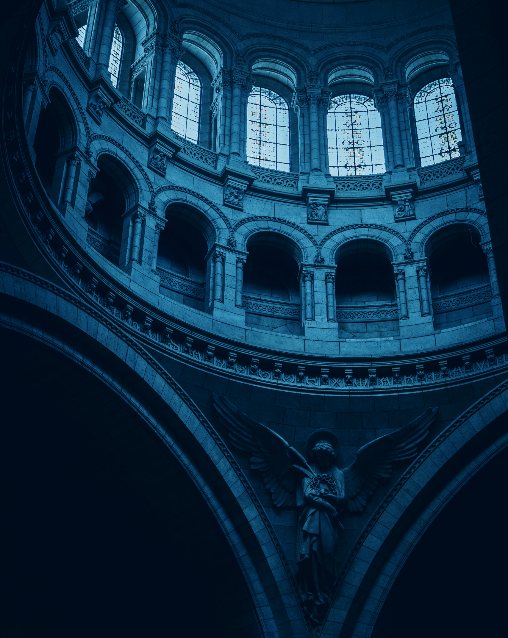
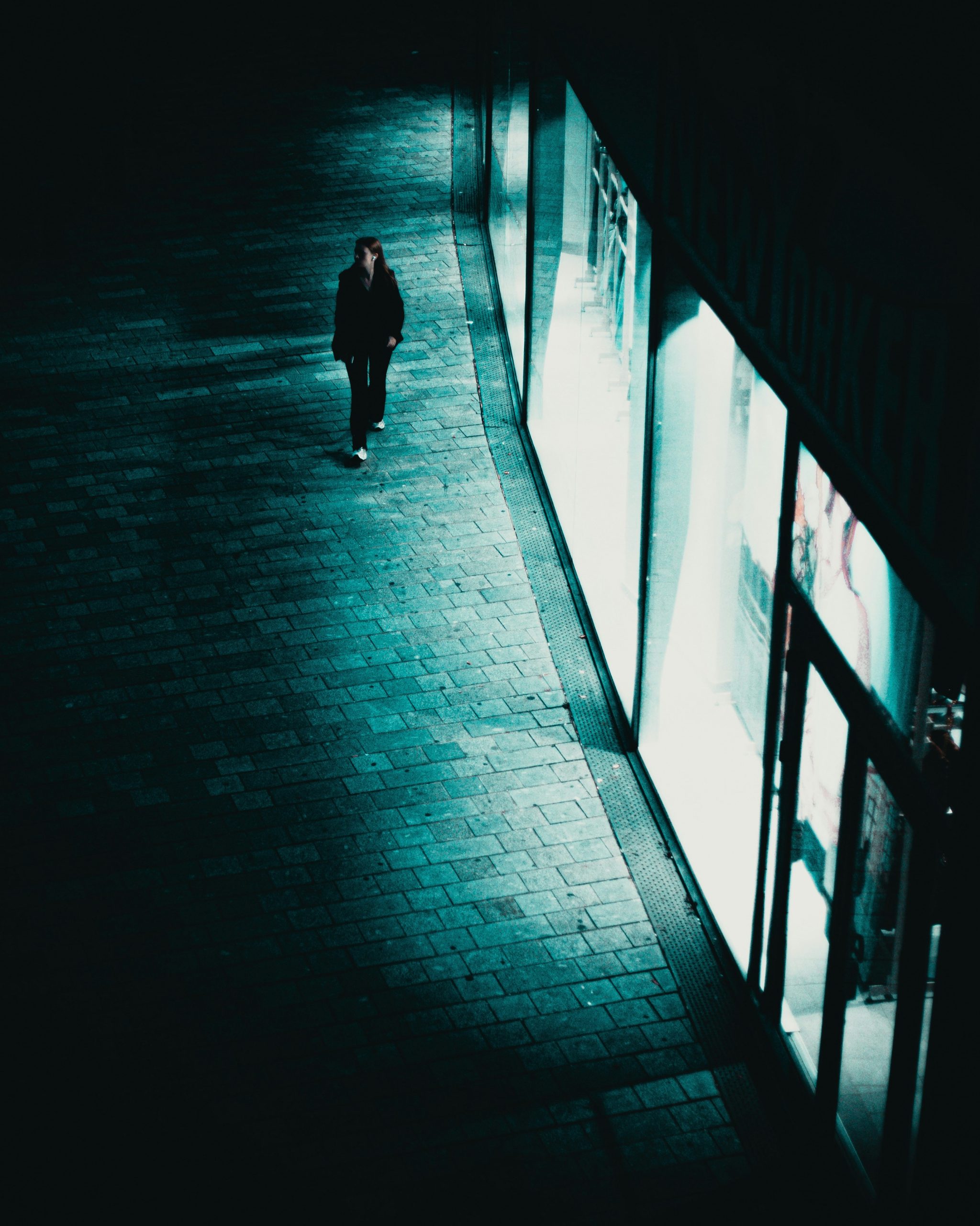
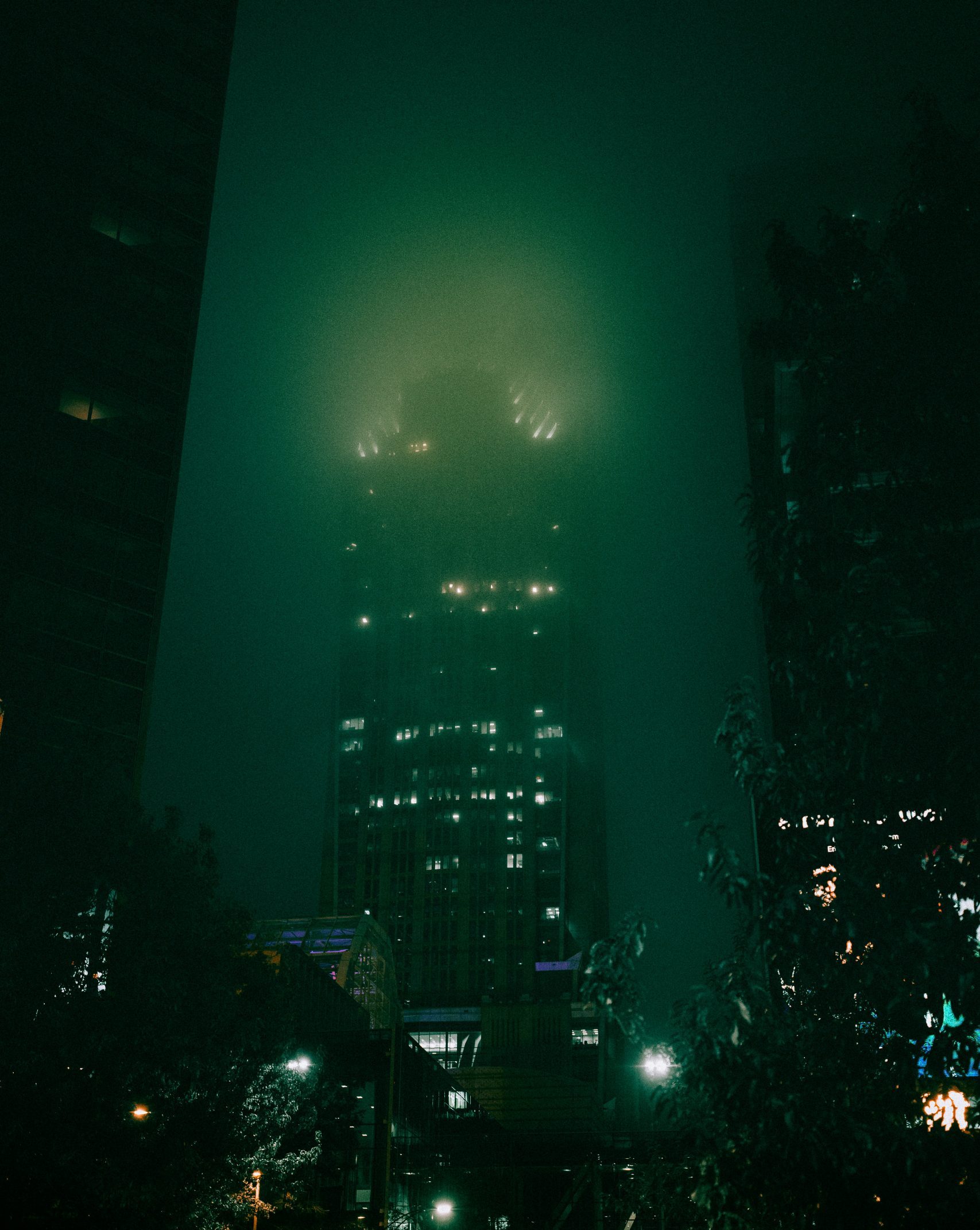
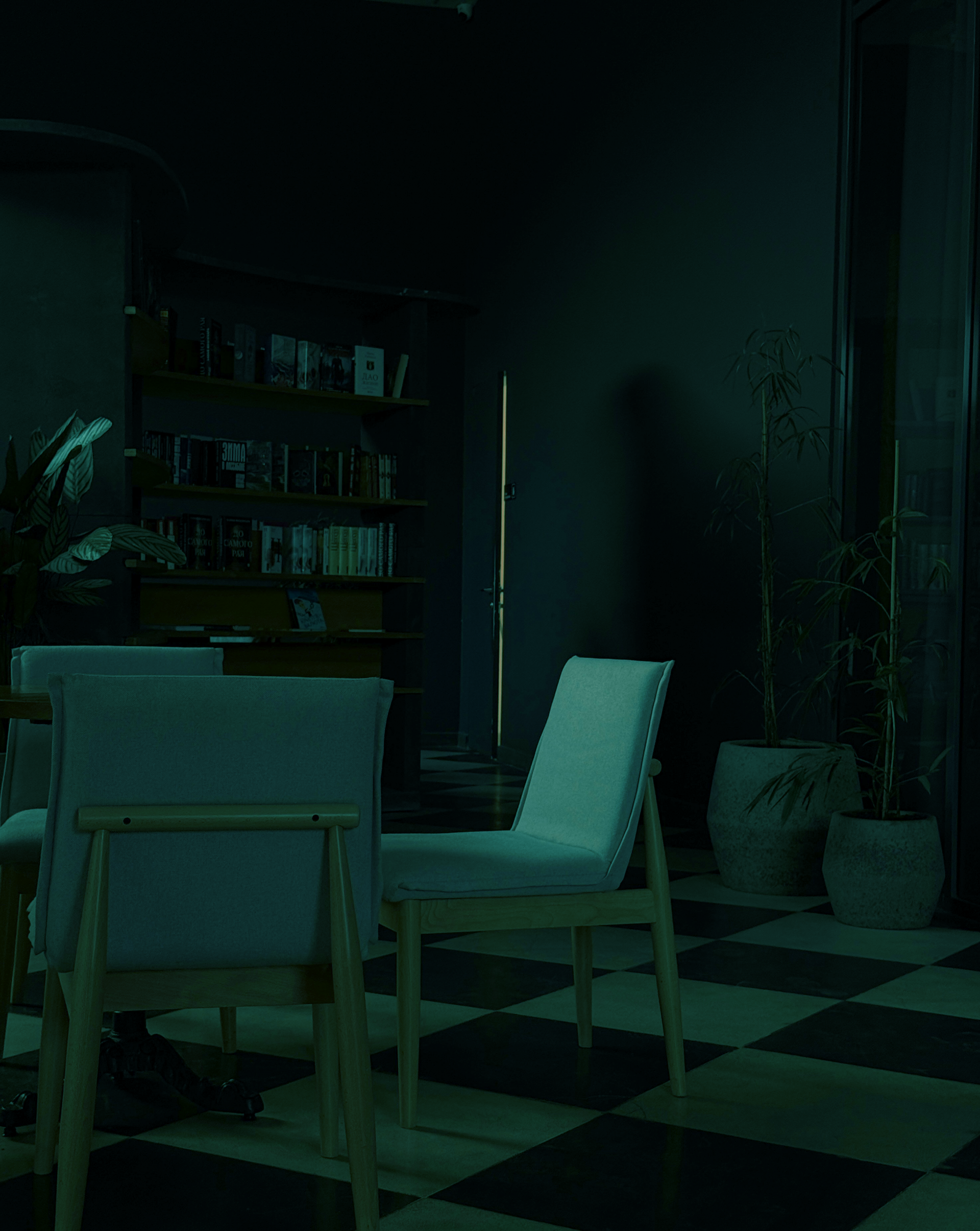
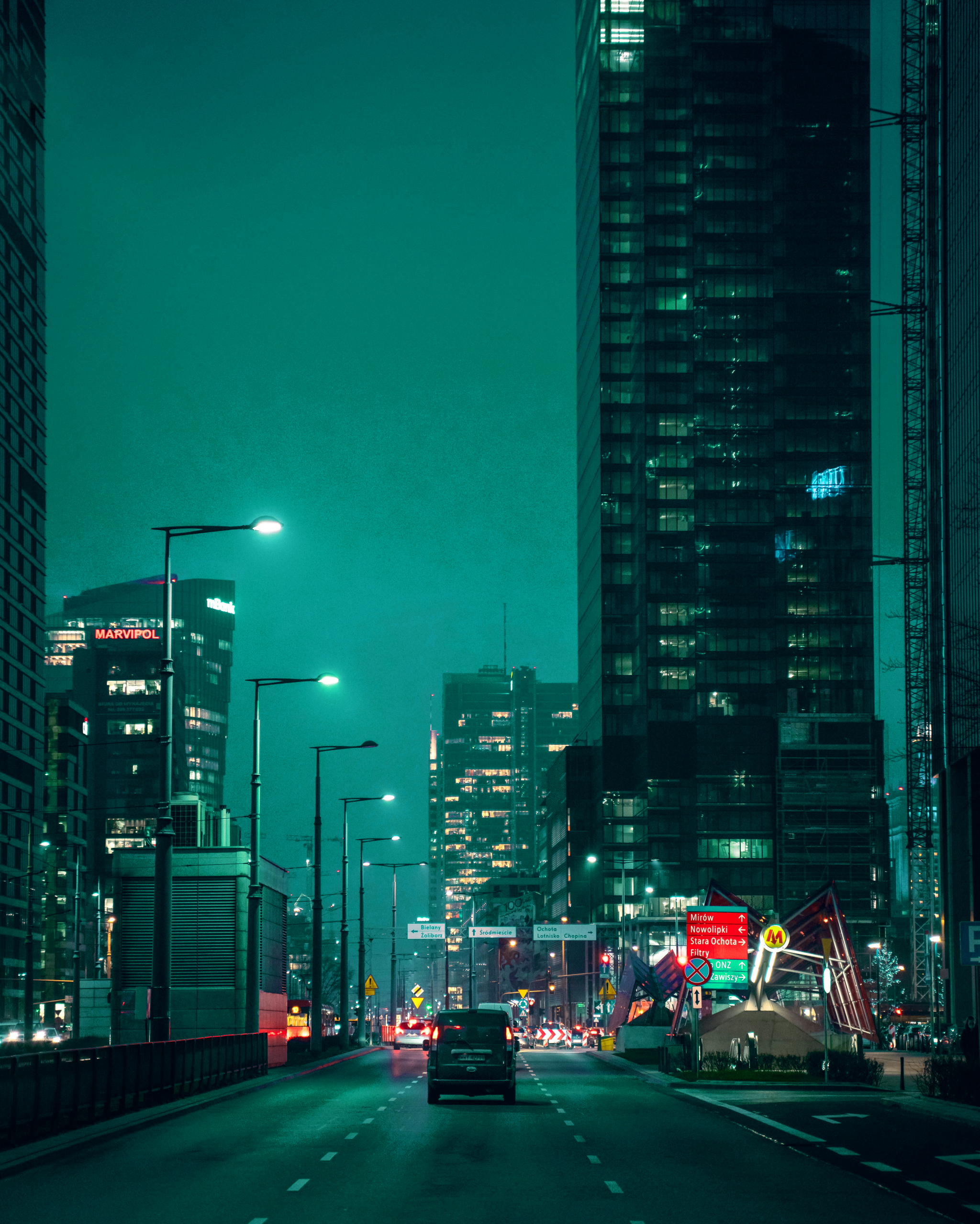
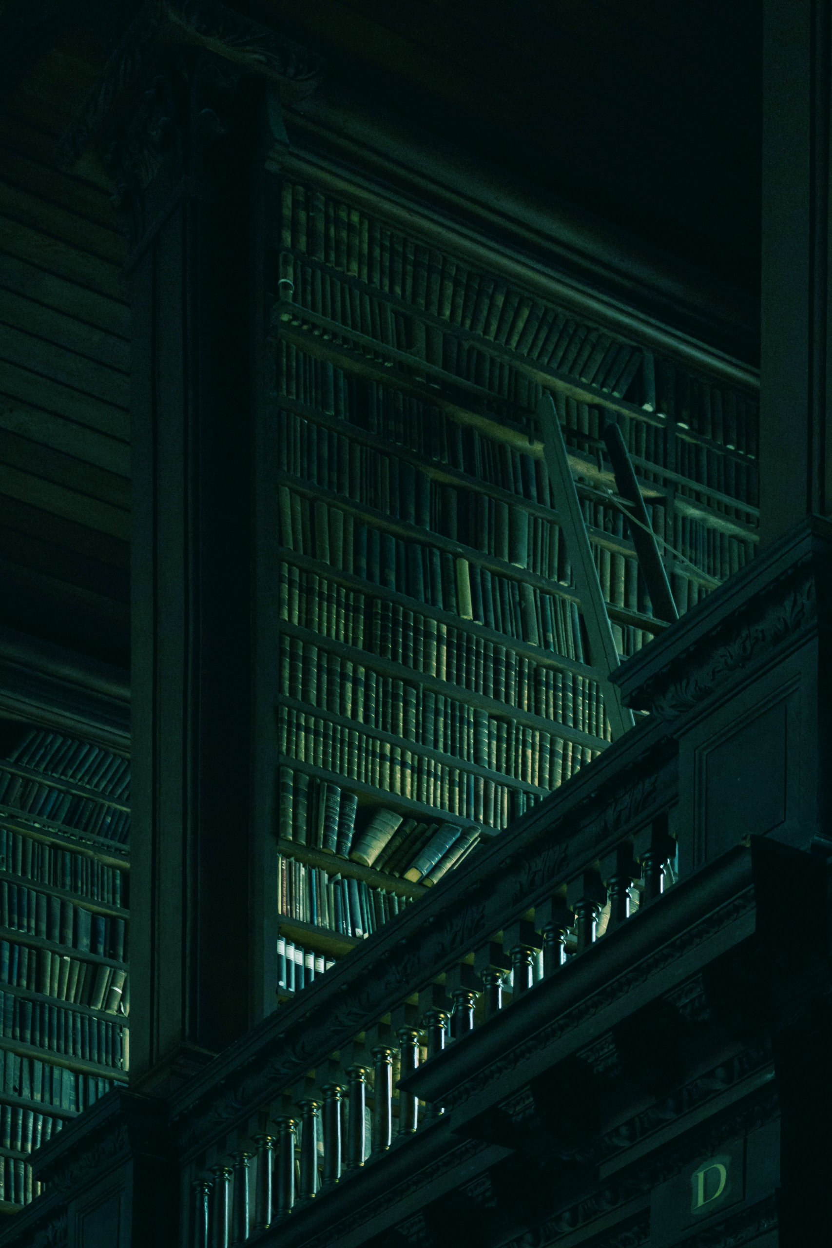
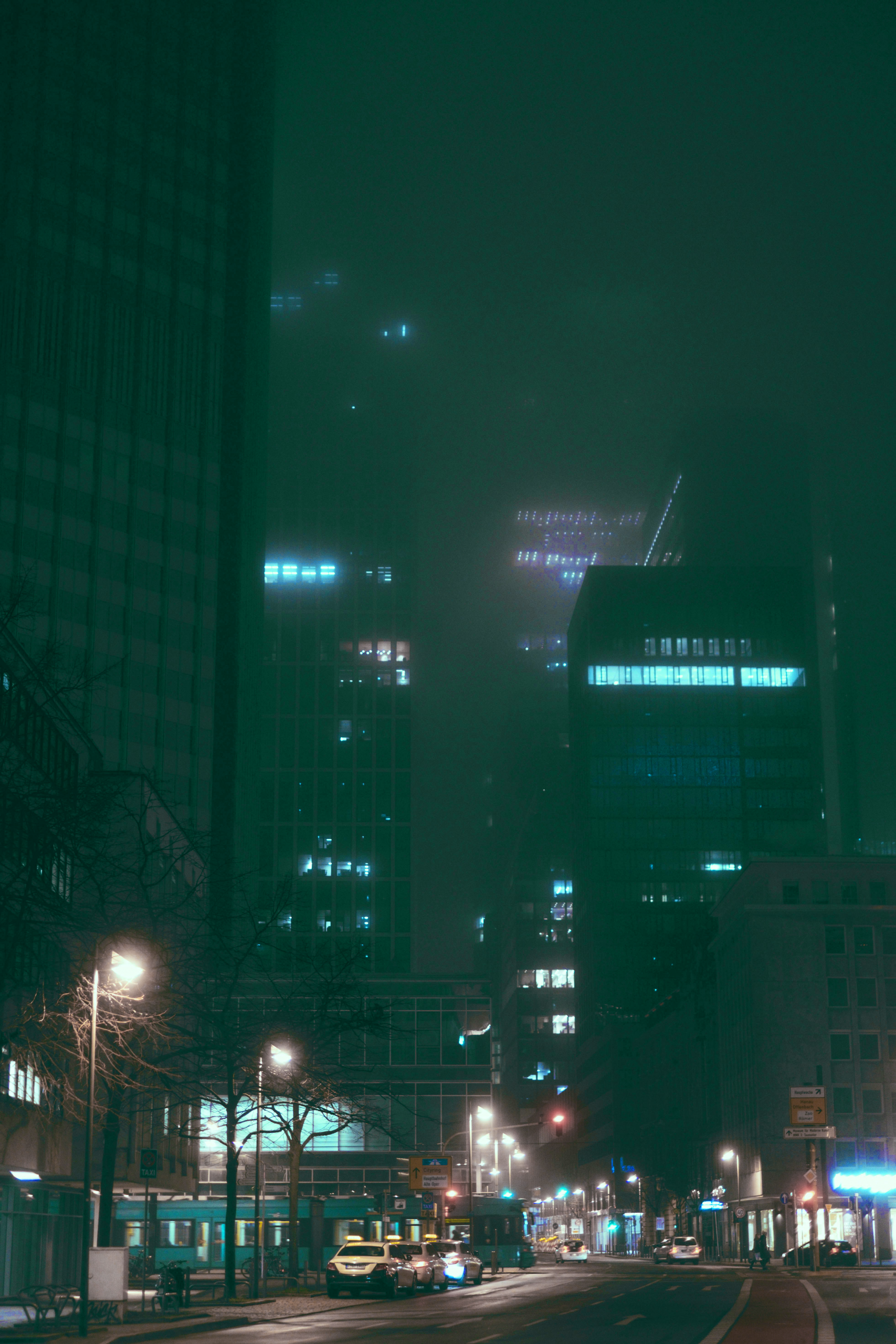
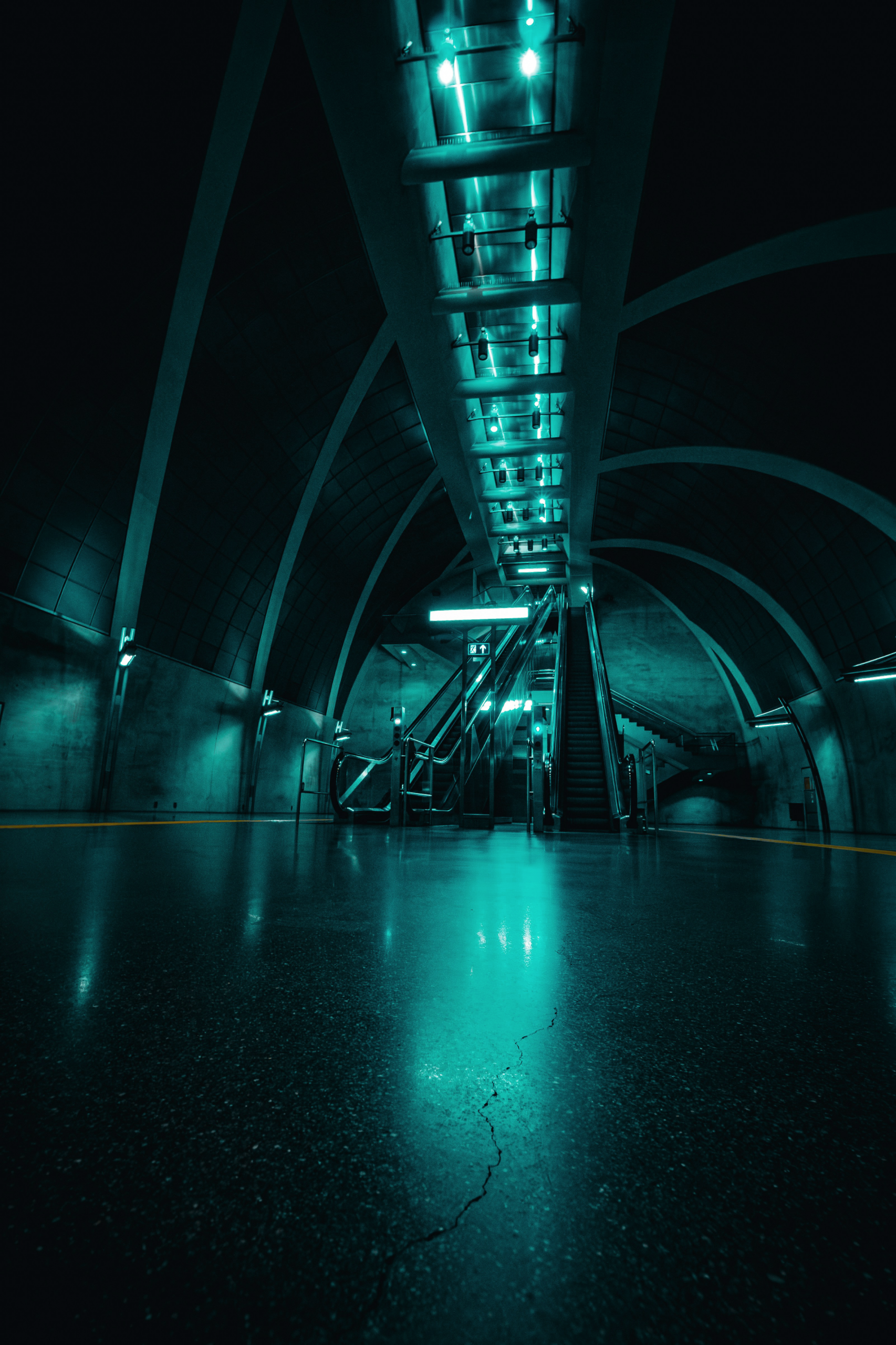
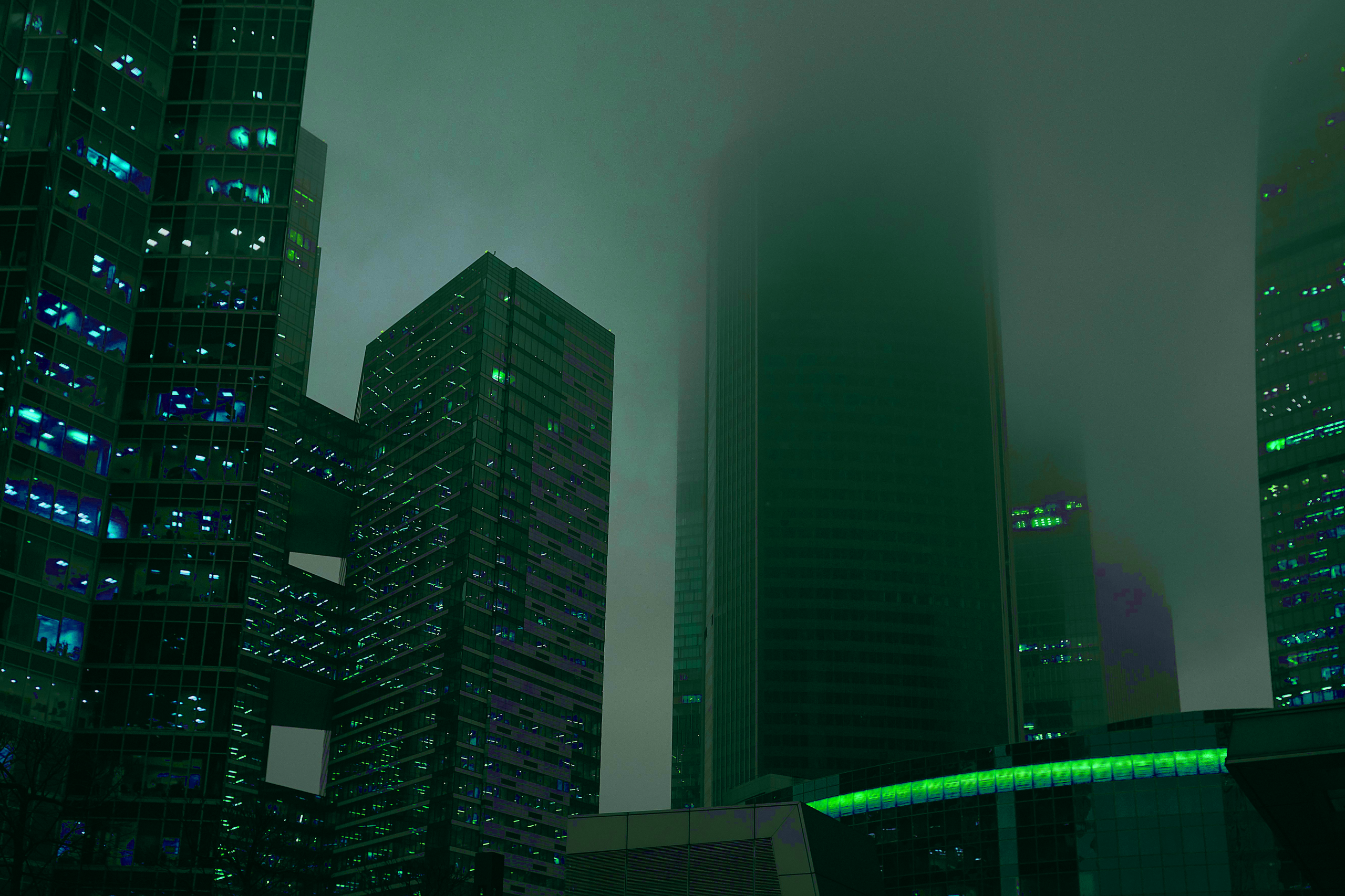
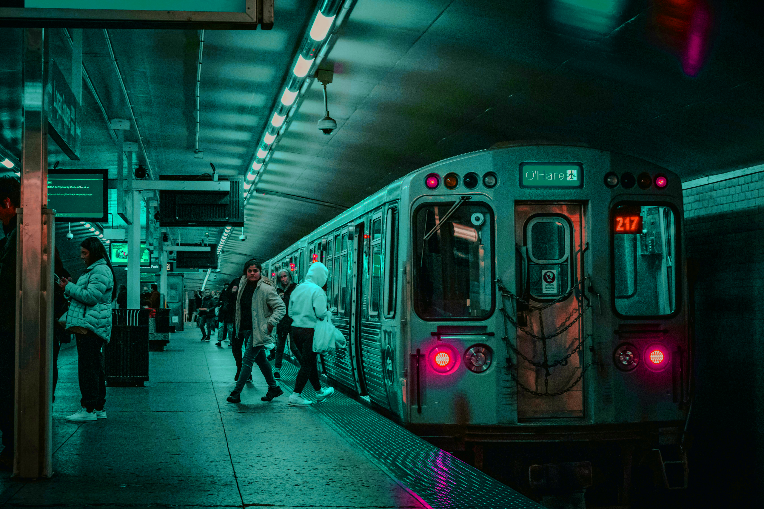
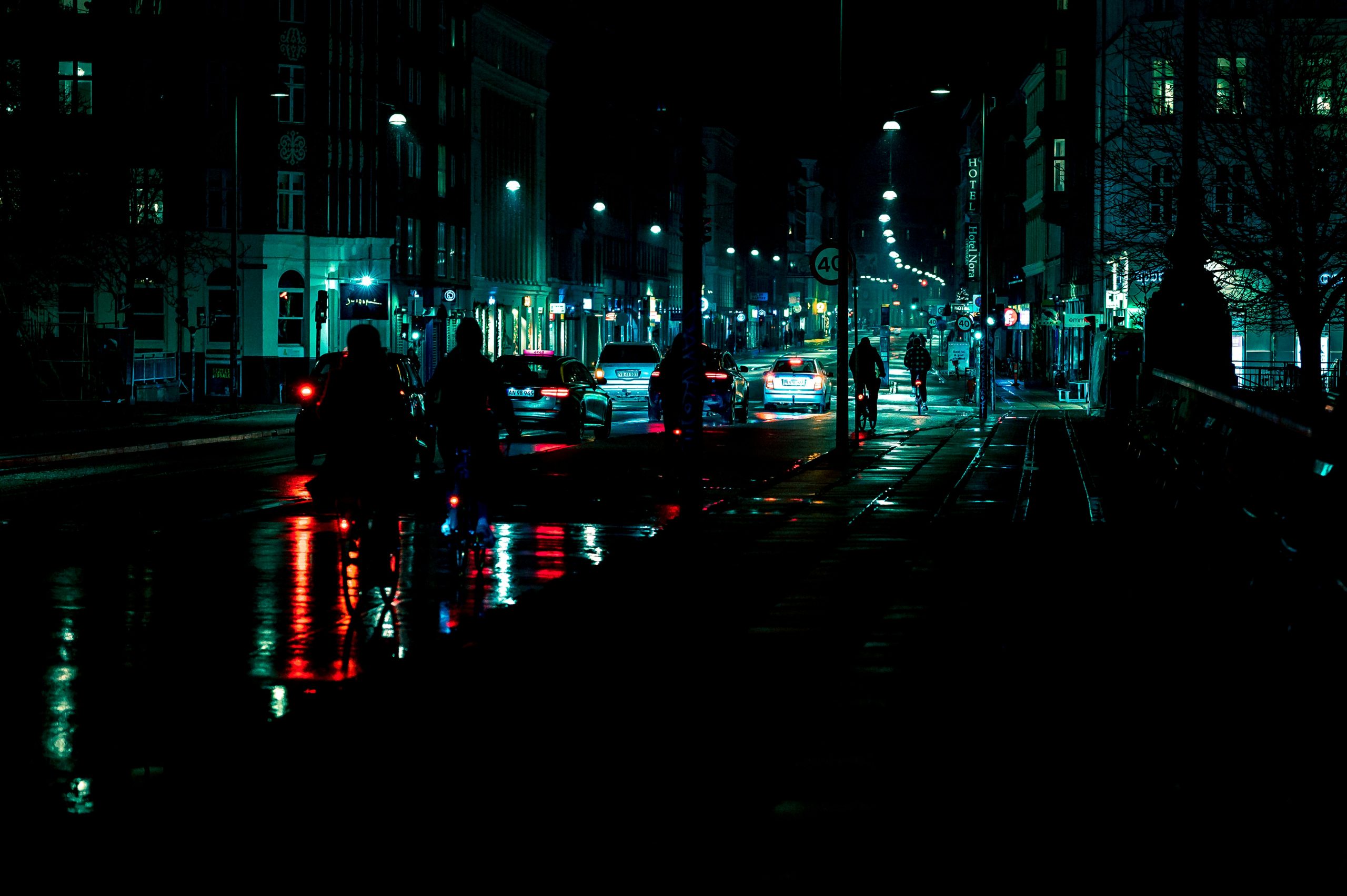
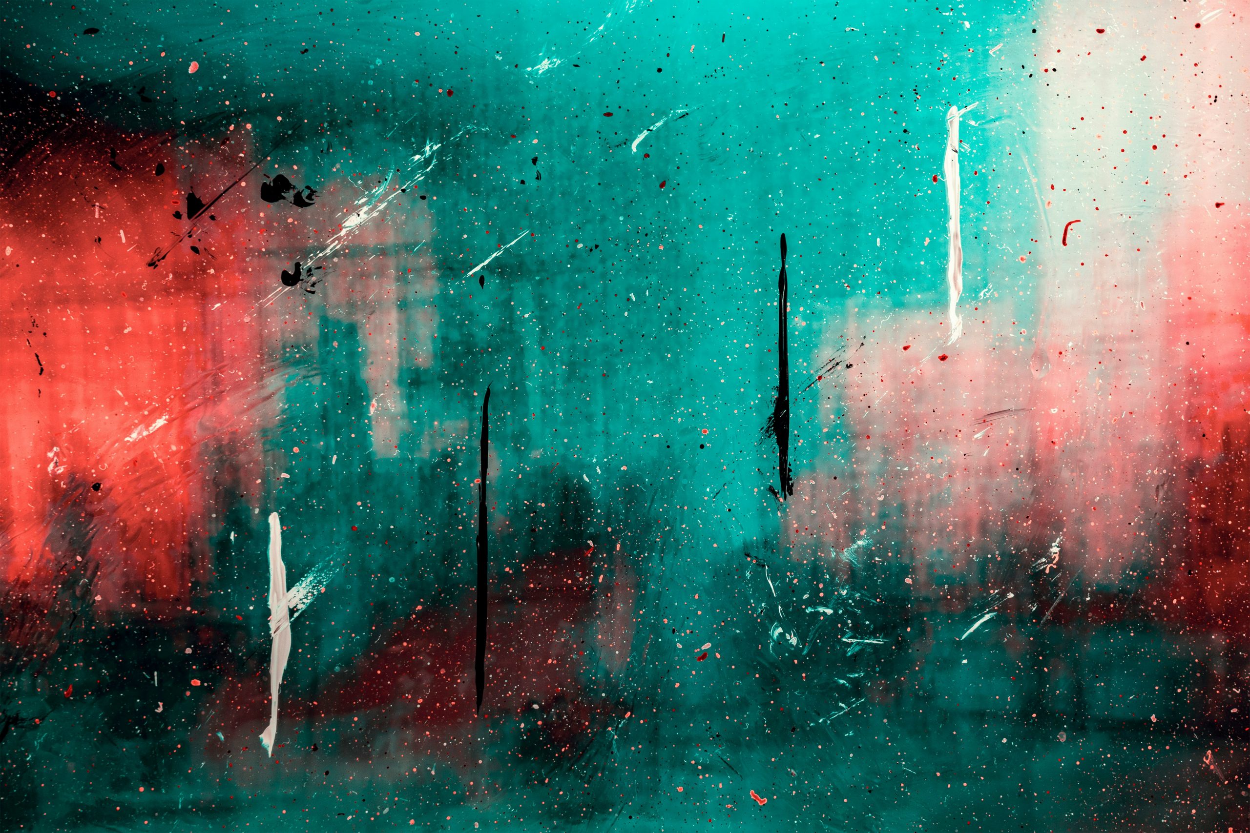
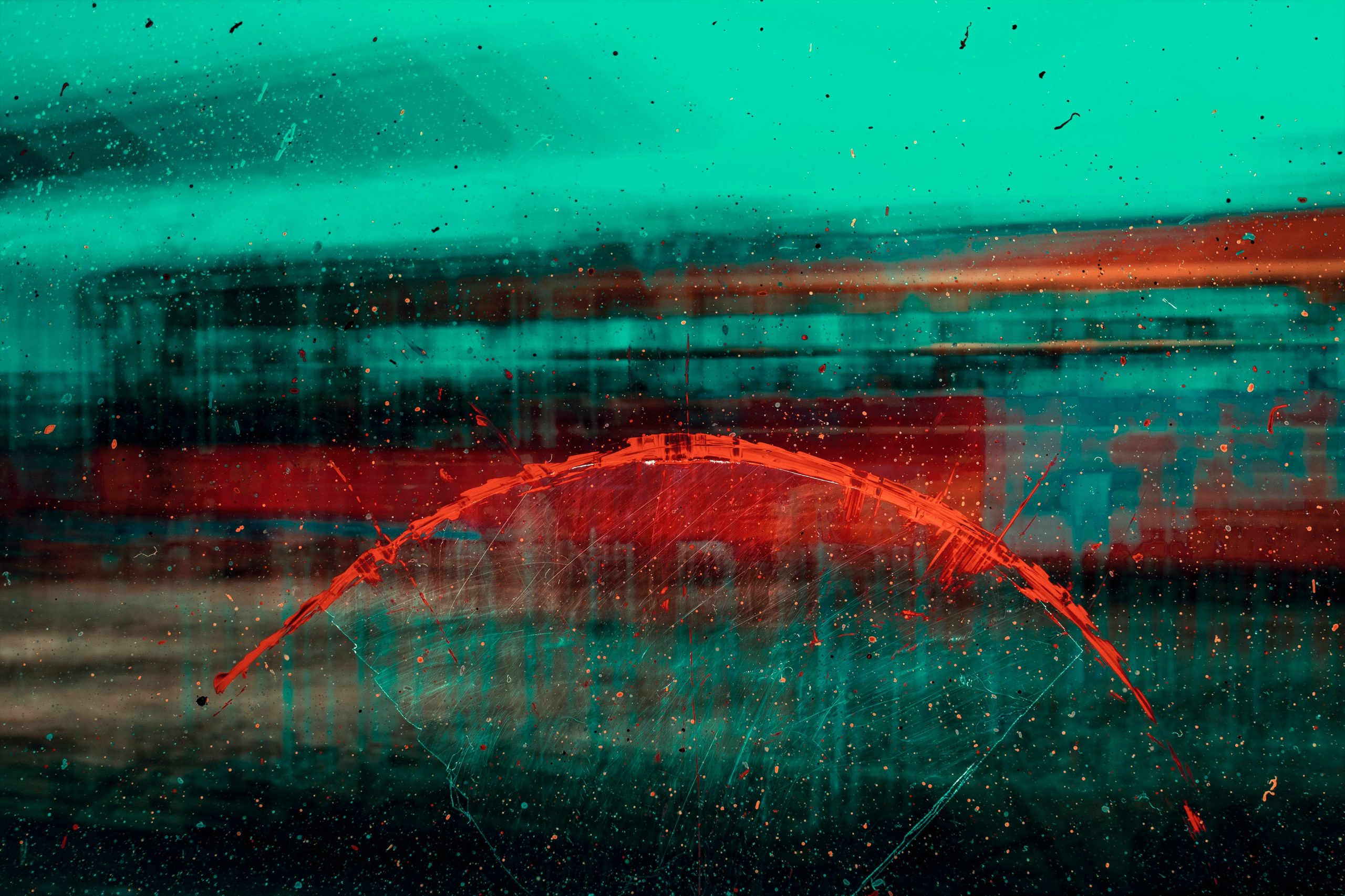
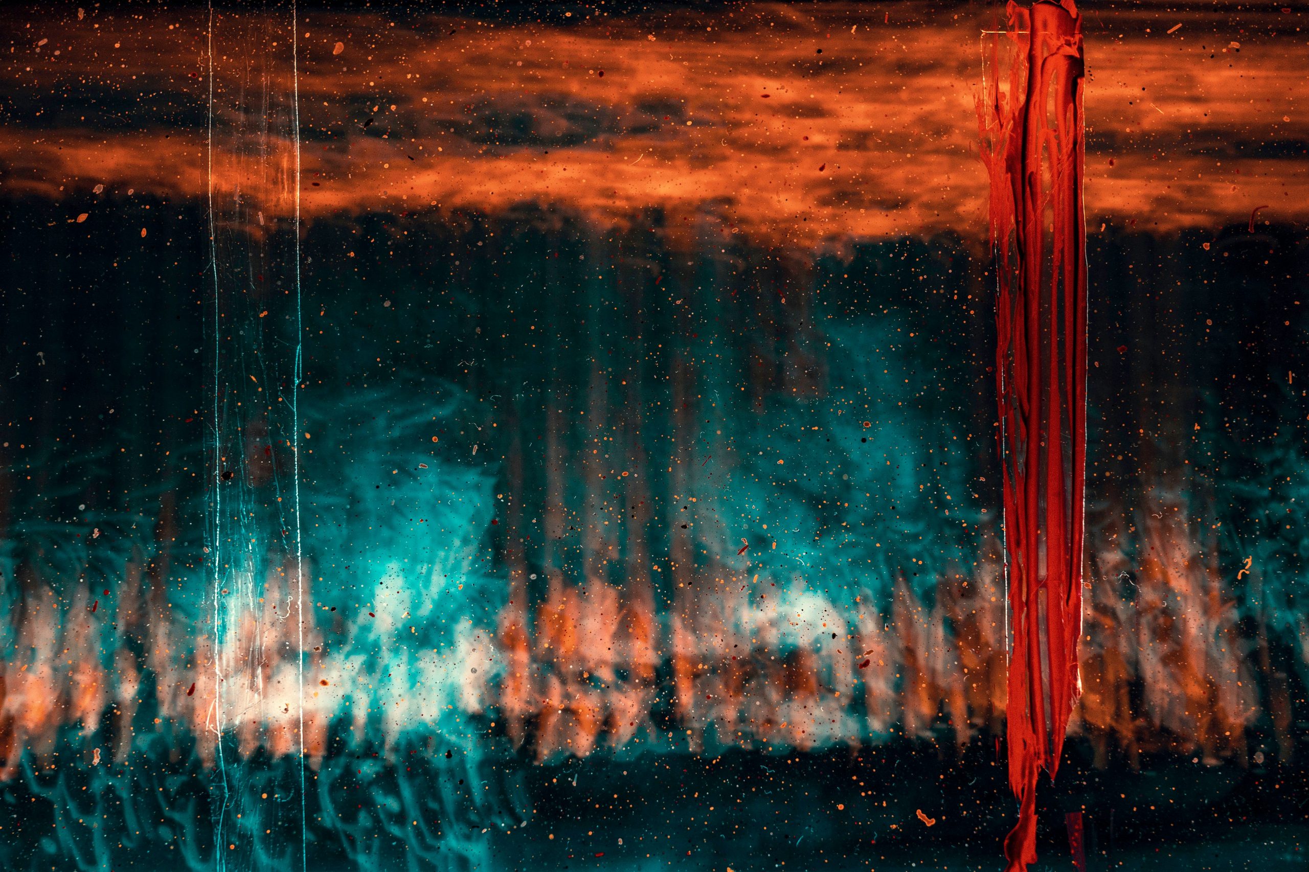
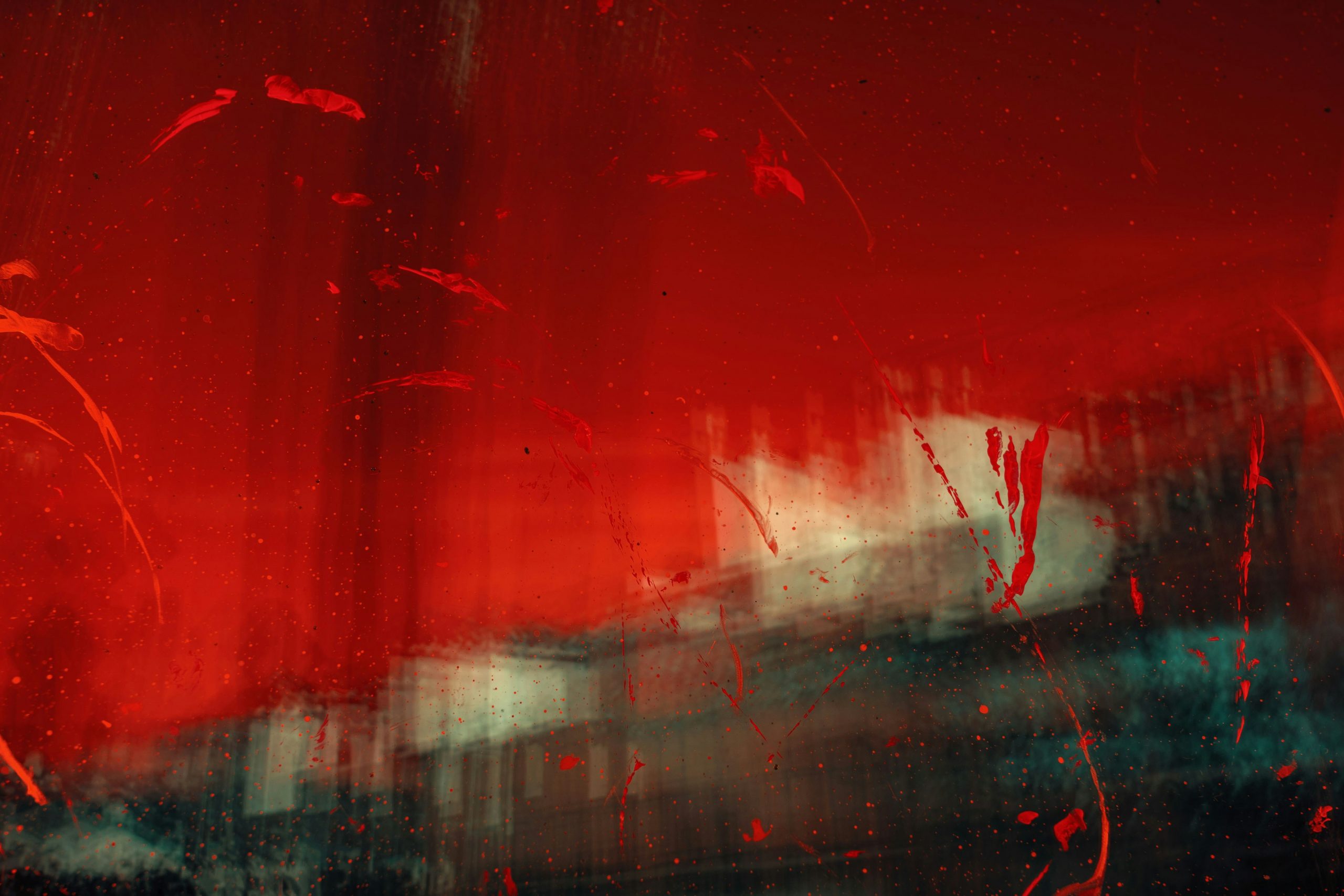
The visual style of the series is cinematic, moody and highly atmospheric. The color palette is dominated by deep blues and muted turquoise-green tones, emphasizing the omnipresent sense of hopelessness within the world of “Into The Red Sky“. A gritty, worn-down aesthetic subtly reflects the corruption and moral decay that have taken hold of the society Jaden lives in.
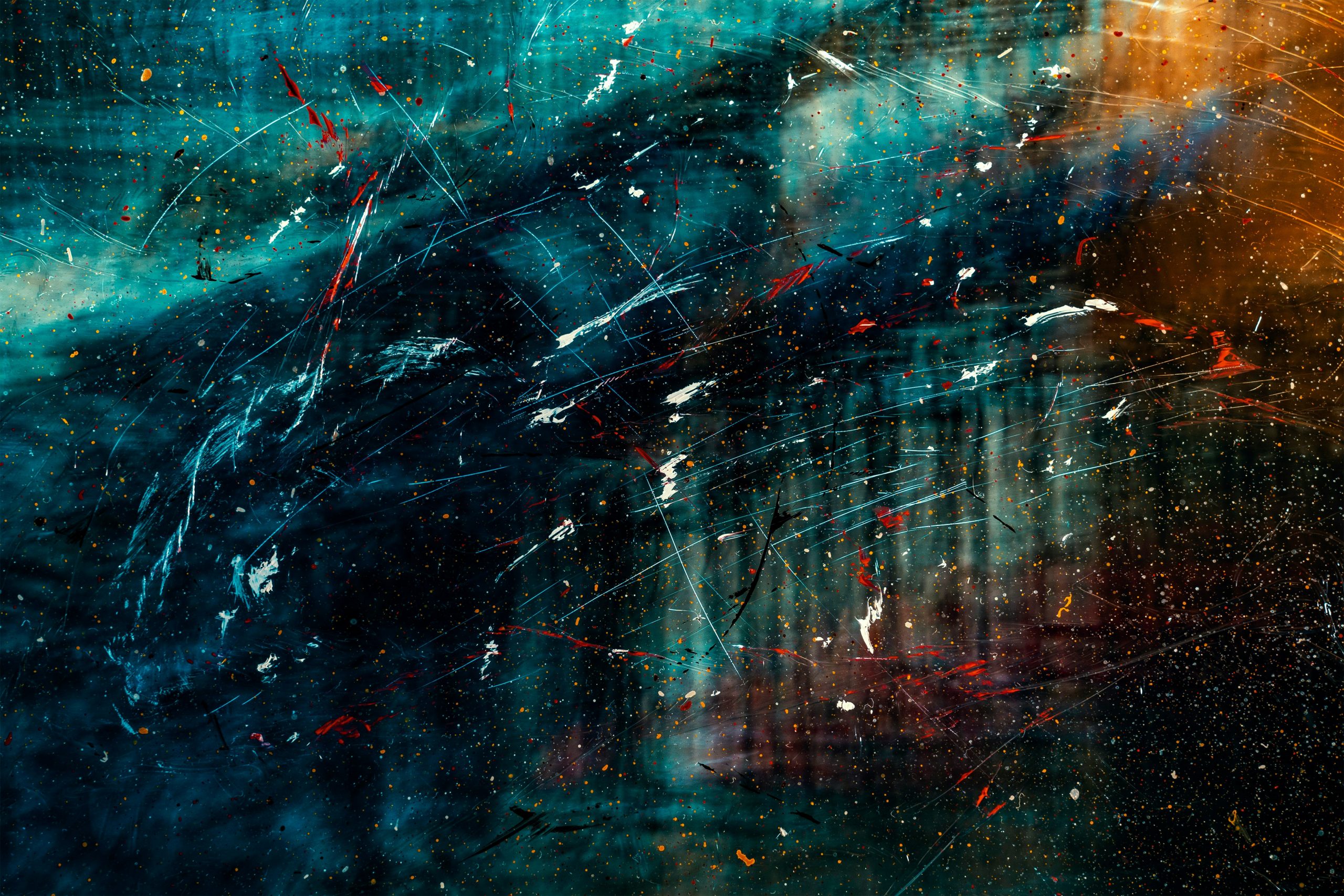
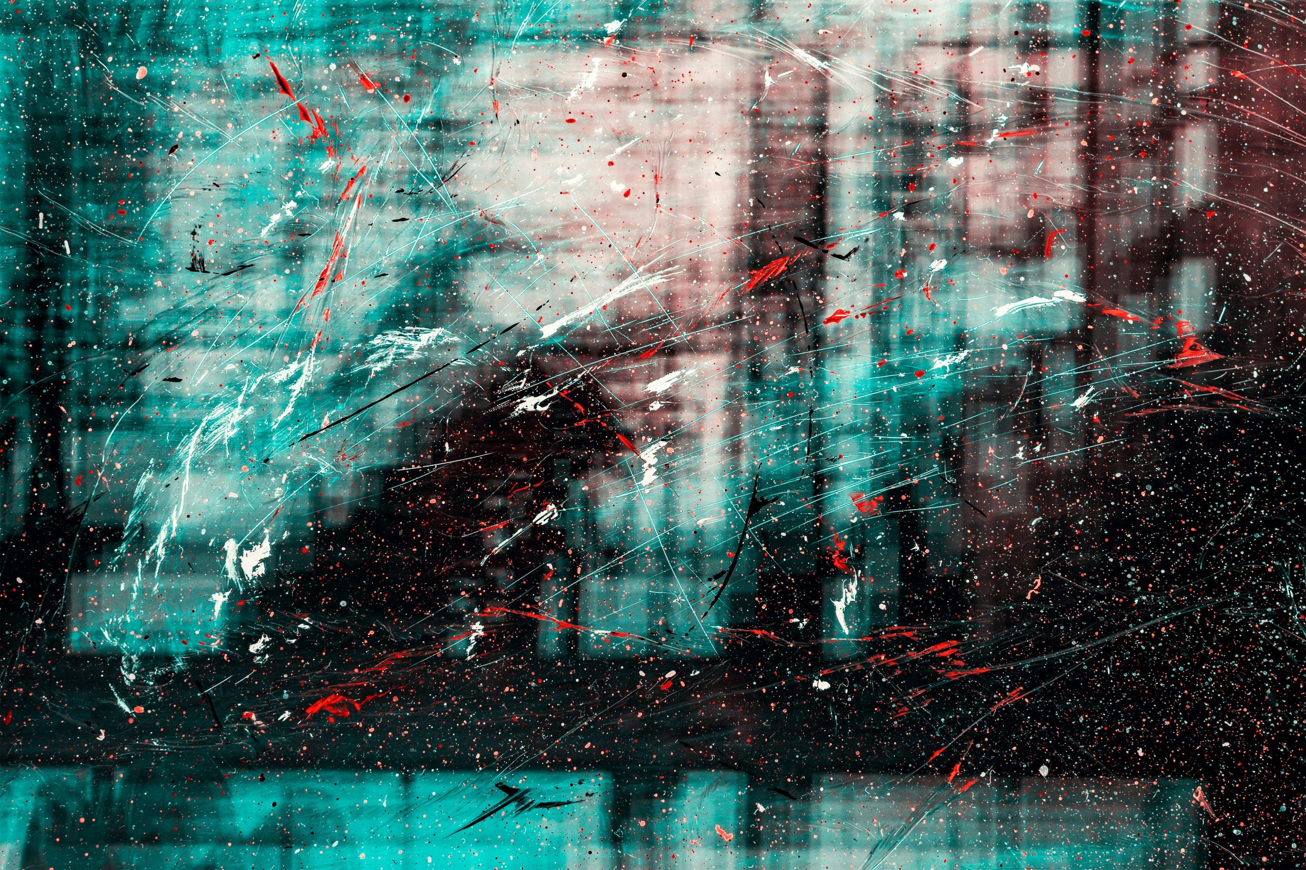
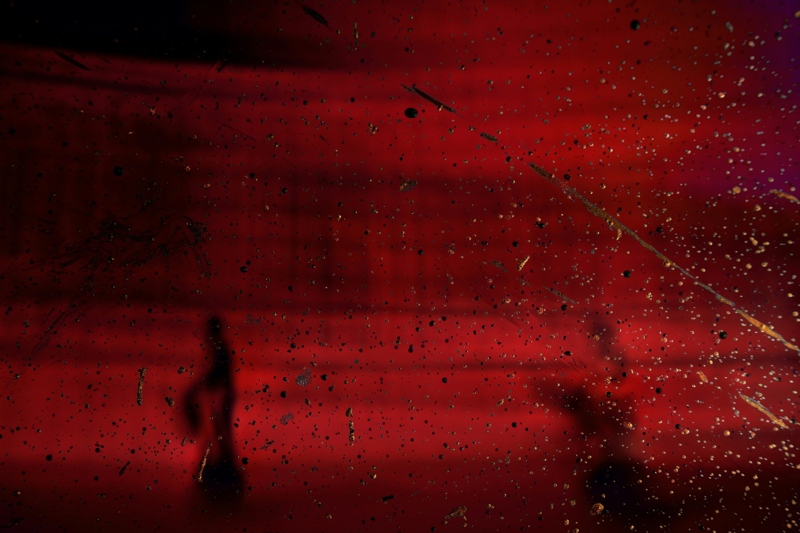
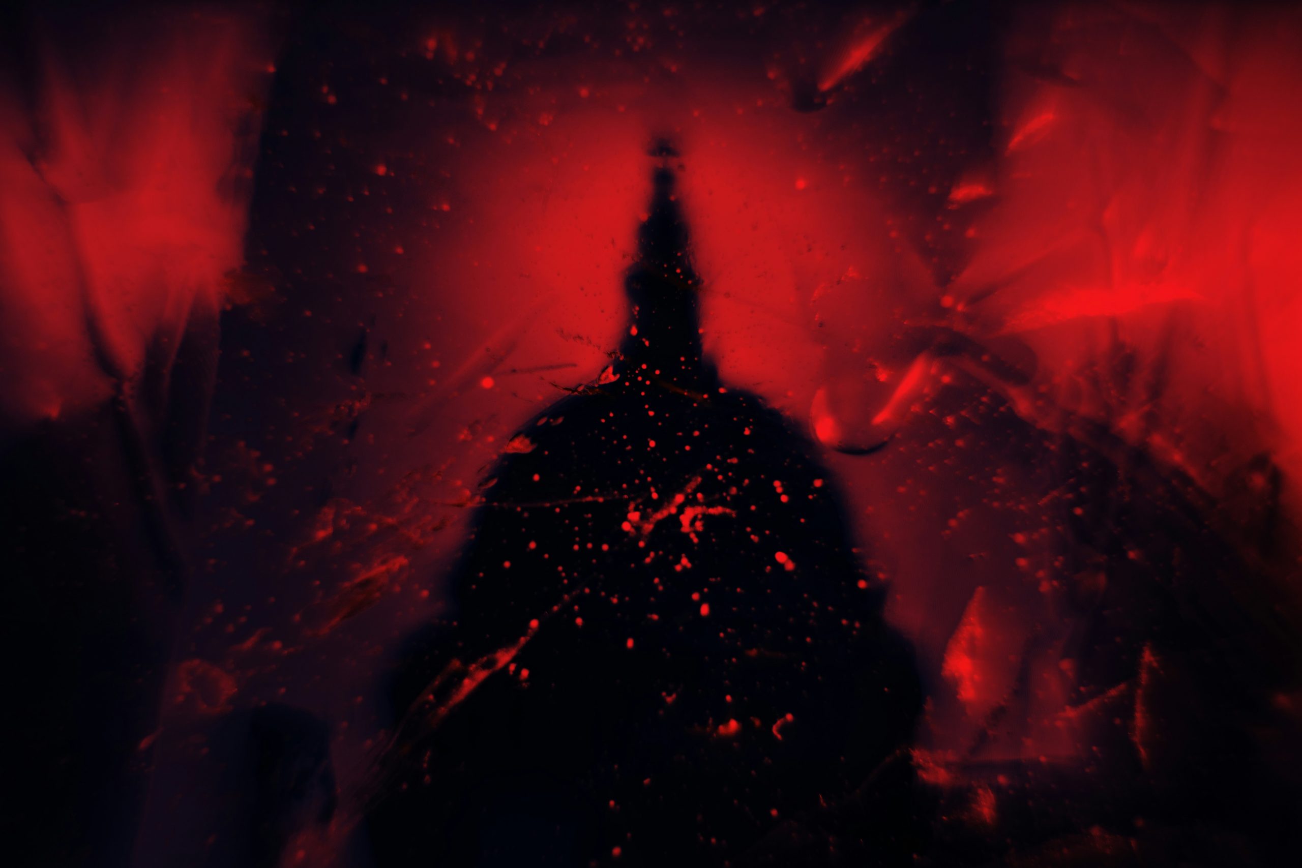
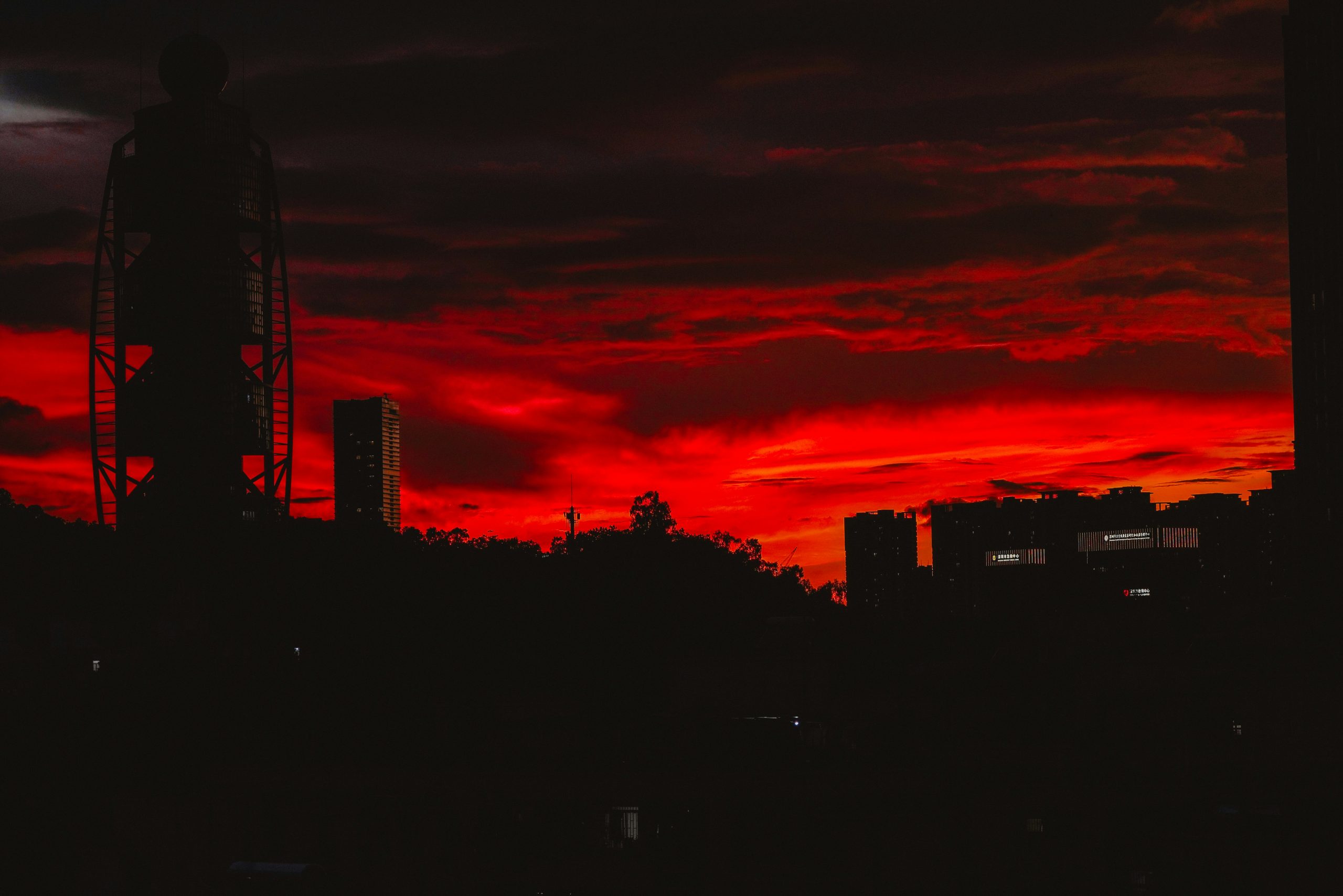
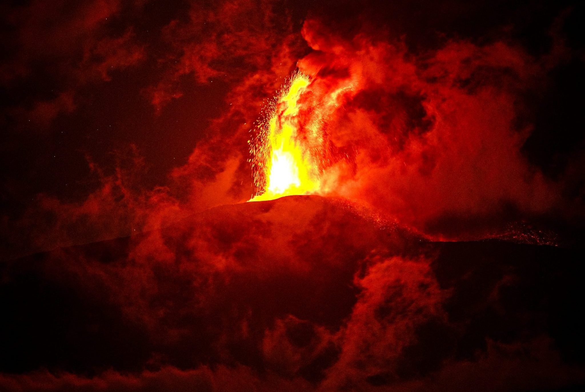
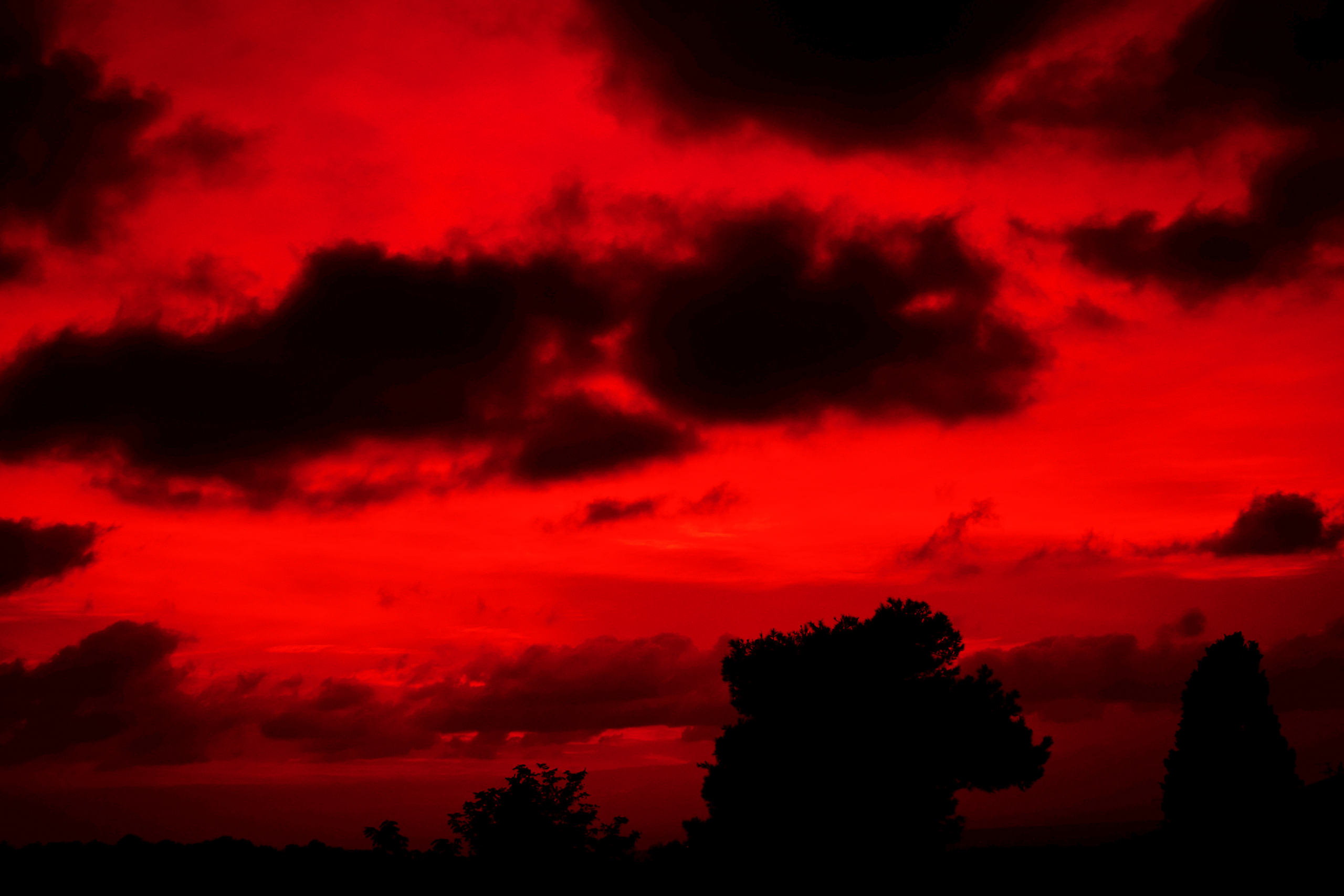
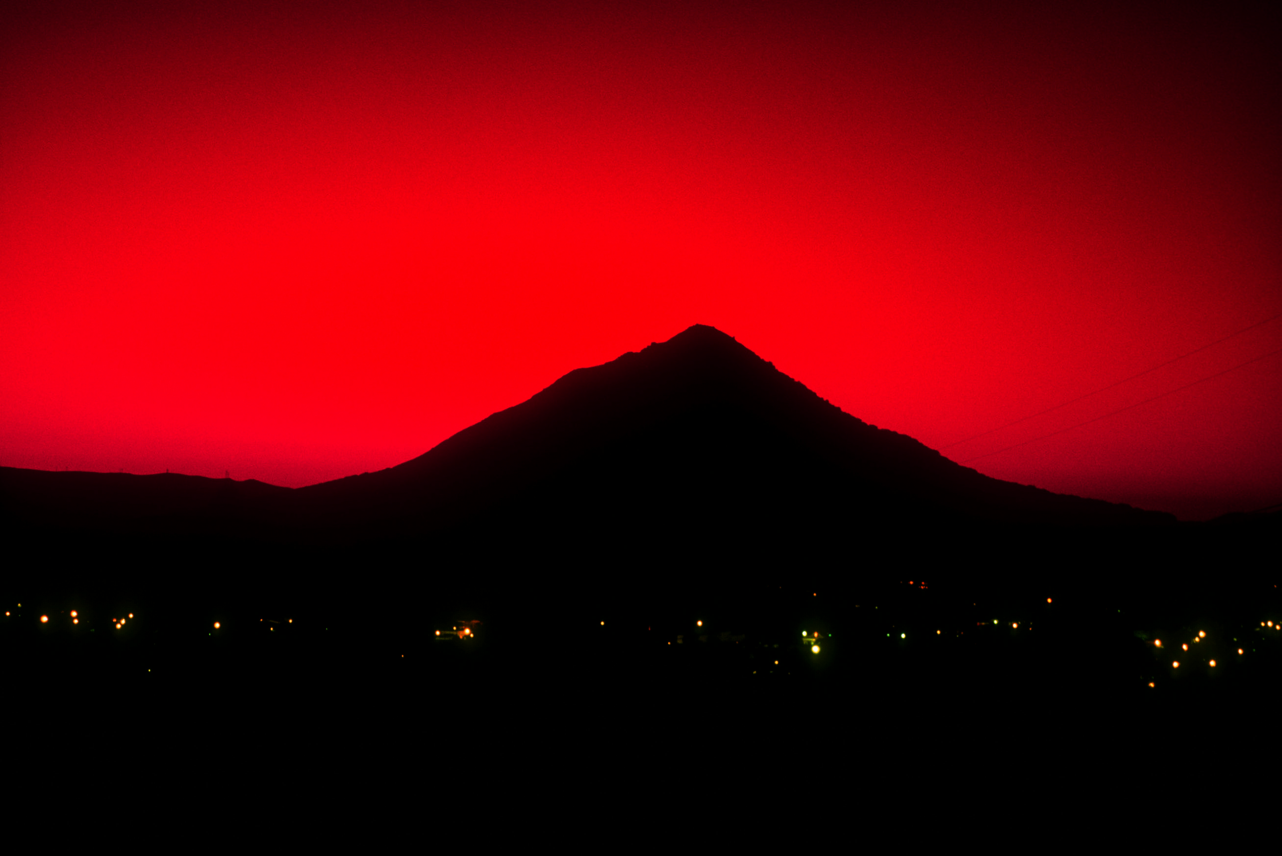
This visual language also externalizes Jaden’s inner state. His depression and deteriorating mental health are mirrored through the environment, immersing the audience in his perspective and allowing them to experience the world as he perceives it. As the supernatural elements of the story emerge, the imagery begins to distort and decay, gradually shifting into unsettling, blood-red hues.
Light and shadow are used deliberately to create a constant sense of unease, tension and the feeling of being watched. The overall goal is to craft visuals that deeply immerse the viewer, strengthen the emotional journey of the story and remain aesthetically striking, reminiscent of biblical paintings, reinterpreted through a modern, anime-inspired visual style.